As part of my ever-expanding attempt to grow as an author and learn about the book industry, I am constantly reading, absorbing lessons from other writers, studying my own tactics and reformulating them, and, yes, re-thinking the stories I write and how I've presented them, including the covers.
For example, does a particular cover accurately reflect the story and characters? Does it help readers know what genre(s) and sub-genre(s) a story falls into? Does it brand the series (where applicable) and the kinds of stories I write? Is it eye-catching and appealing to readers?
I've already changed covers once for The Prophecy and Light's Bane, at the same time that I commissioned L.J. Anderson (my cover designer, with Mayhem Cover Creations) to create covers for The Enemy Within, Tempered, and In All Things, Balance. To the left is the original cover she created for The Enemy Within.
I love this cover. No, I really do. It's a great cover for a romance novel. Only thing is, the stories in the Daughters of the People Series aren't straight romances as the cover implies. They're a mix of steamy romance, romantic suspense, and urban fantasy, something that needs to be reflected in the cover.
After L.J. finished TEW's cover (above), she began working on Tempered. We went through several photos for the cover, picked a color scheme, and scheduled the cover's production for October. All well and good, right? Well, not exactly. I've never really been happy with these covers, not because of the quality (L.J. always does really great work), but because the covers don't reflect my vision of what they should be. I'd always pictured them in my mind as a cross between the covers for Kim Harrison's covers (Urban and Dark Fantasy) and something like Liliana Hart's covers (the Romantic Suspense ones; Dane, Cade, etc.).
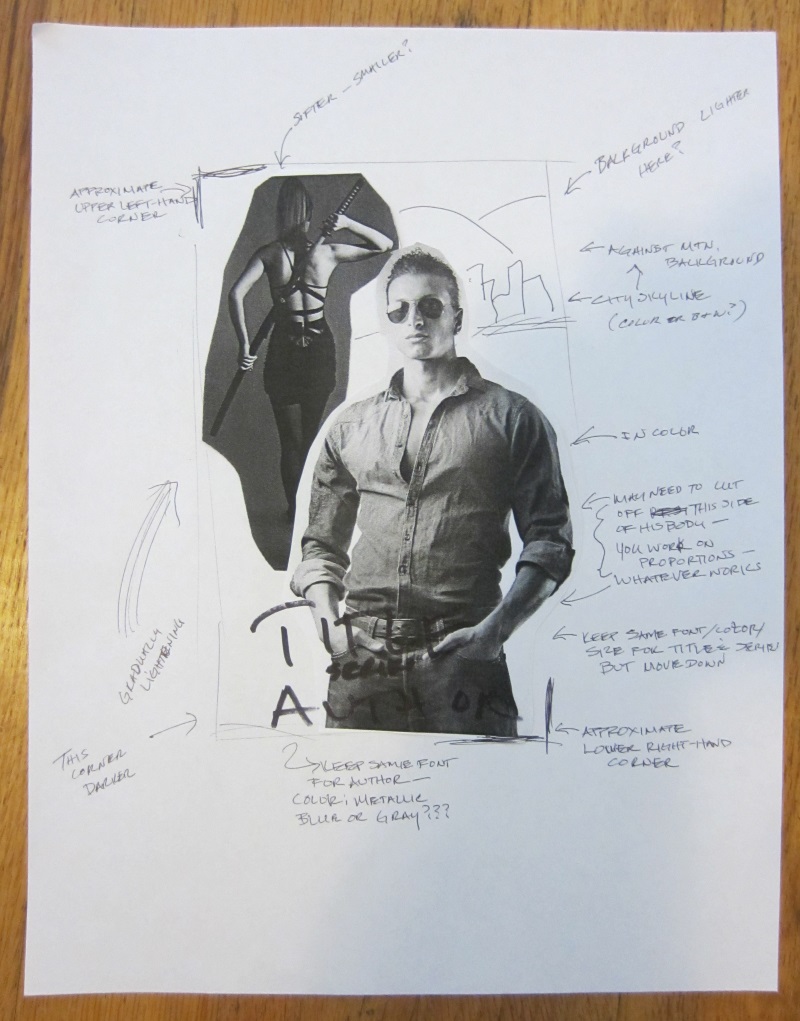
One night, in a fit of creativity and insomnia (not necessarily a good combination), I decided to cut and paste a mock cover so L.J. could have a visual.

I forwarded my Kindergarten-esque attempt to her. Turns out, she loves doing covers like this. One thing led to another and she eventually came up with this design.

That's Asheville in the background and Blowing Rock in the foreground. No, this is not where the story is set, but it's close. (If you're wondering, it's set in northeast Georgia.)
I asked L.J. to make a few tweaks, and today, she sent me what I hope will be the final cover, more or less.
Check out that awesomeness! This is much, much closer to my vision of what the covers should be for this series, something I thought we could only obtain with custom photos. Once again, L.J. has come through in a big way.
Now, sometimes I get comments from people who aren't writers along the lines of, there's nothing to publishing books, you just slap them together and put them online, and so forth. I hope this blog post dispels that myth. Writing a story is difficult, but that's just the beginning. It takes much effort and many hands to go from idea to polished story to published book. Thankfully, I have some of the best hands in the business helping me.
ETA: Looks like we might, maybe have a couple of changes to the way the title is laid out, possibly. For now, I'm using the last cover, above, because it is just that awesome, but don't be surprised if I announce a final version that looks slightly different.
